Two-Column Filters Layout
Discover how a new two-column layout with sticky filters increased user engagement and led to a 21.9% rise in conversion rates!
Metric
Add-to-cart rate
Lift change
+7.6%
Control
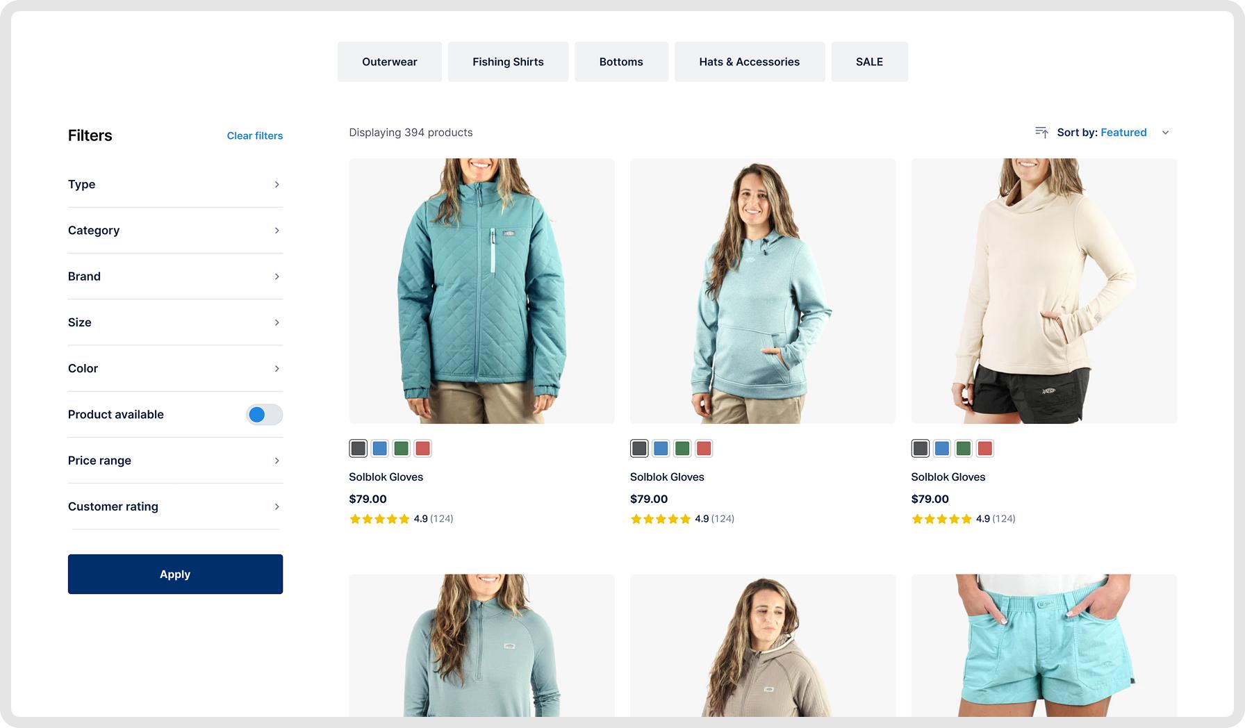
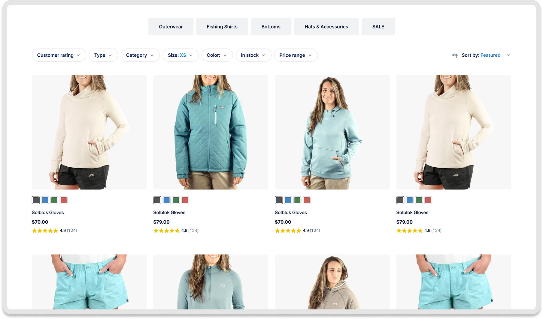
Variation
If users are presented with a cleaner, two-column layout that separates filters from results, then they will engage more with product filters and convert at a higher rate, because the experience feels more organized and allows for easier navigation and refinement of product lists.
What We Changed
- Introduced a two-column layout for desktop.
- Added a left sidebar (1/3 width) for filters.
- Placed product results on the right (2/3 width).
- Made filters sticky and hideable.
Detailed breakdown
Add-to-Cart Rate
+7.5%
Average Order Value
+22.6%
Bounce Rate
-8.8%
Key Learnings
- A separate filter column made navigation easier.
- Sticky filters allowed for quick adjustments without losing place.
- Organized layout encouraged product exploration.
- Improved user experience led to higher conversion and engagement.