Wider Collection Page
Discover how widening the collection page increased click-through rates by 4.0% while reducing bounce rates by 11.8%. Explore the insights!
Metric
Clickthrough rate
Lift change
+4.0%

Control

Variation
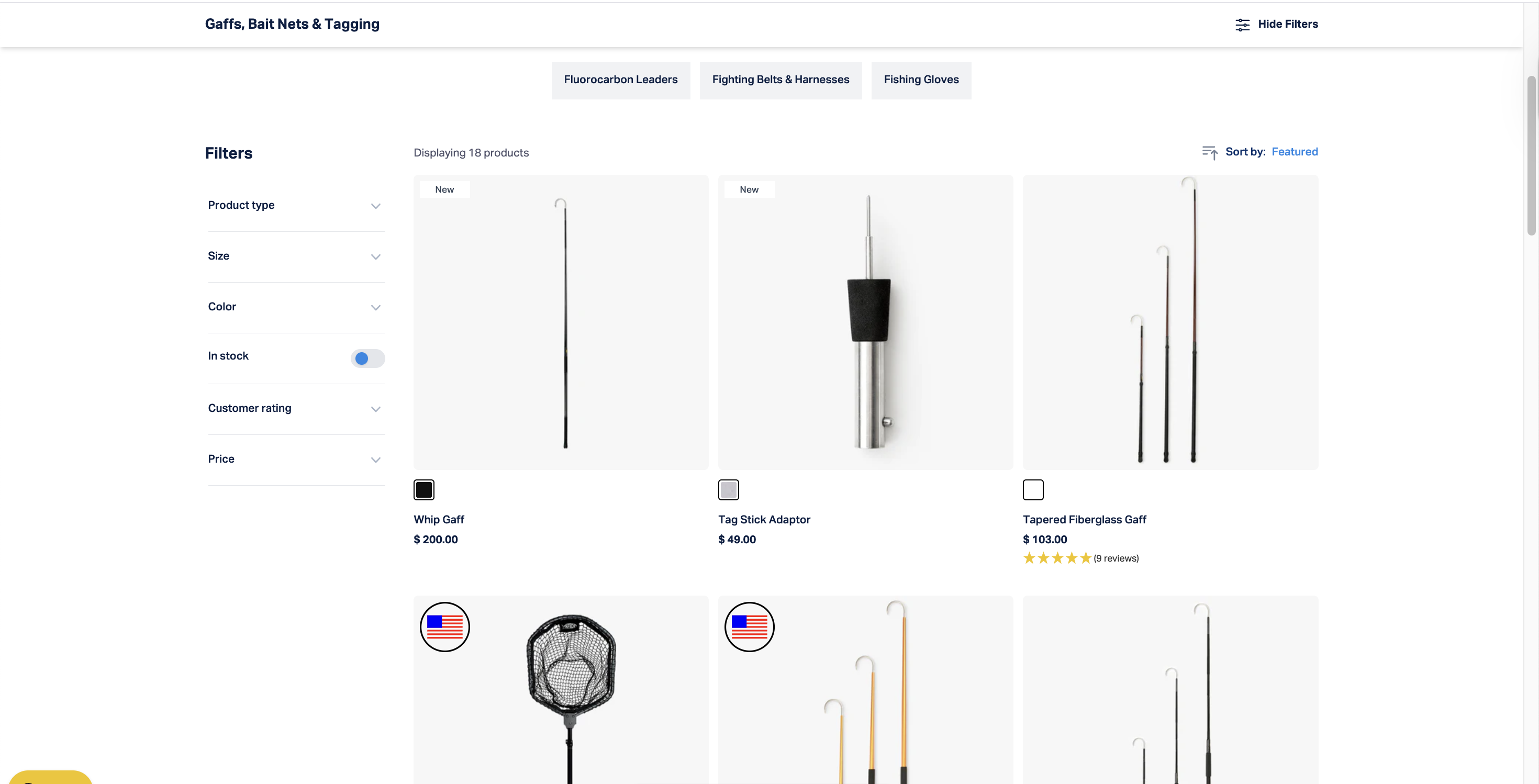
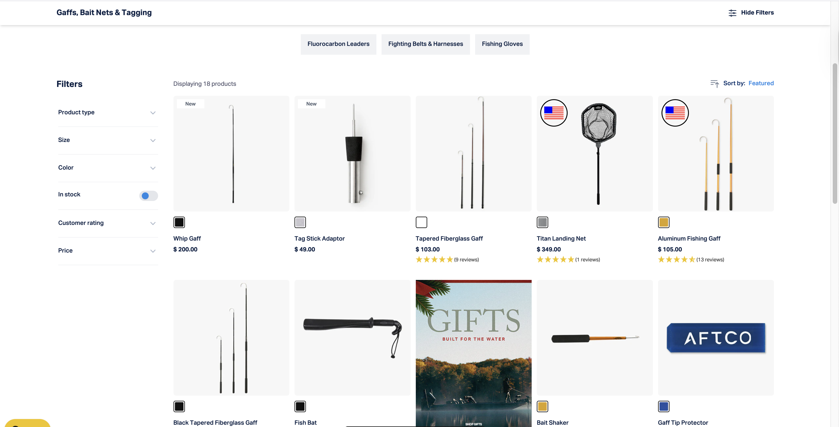
IF we widen the collection page layout on desktop THEN click-through rate on product cards will increase BECAUSE users will see more of the product visuals clearly and experience less visual congestion.
What We Changed
- Increased width of the main content container on desktop.
- Adjusted product grid spacing.
- Ensured sidebar filters remained visible.
- Scaled text and images proportionally.
Detailed breakdown
Click-through Rate
+4.0%
Bounce Rate
-11.8%
Revenue
-5.50%
Key Learnings
- Wider layout improved the click-through rate by showing products more clearly.
- Conversion rate and AoV dropped enough for us to declare this a strong loss.
- The reason for the drop in the "money" statistics wasn't clear.
- Declaring this a loss prevented, but it's worth running again with some modifications.
- Recommendation: run this test again with some additional changes and a bigger redesign to check if there was something getting in the way that we didn't spot the first time around.
