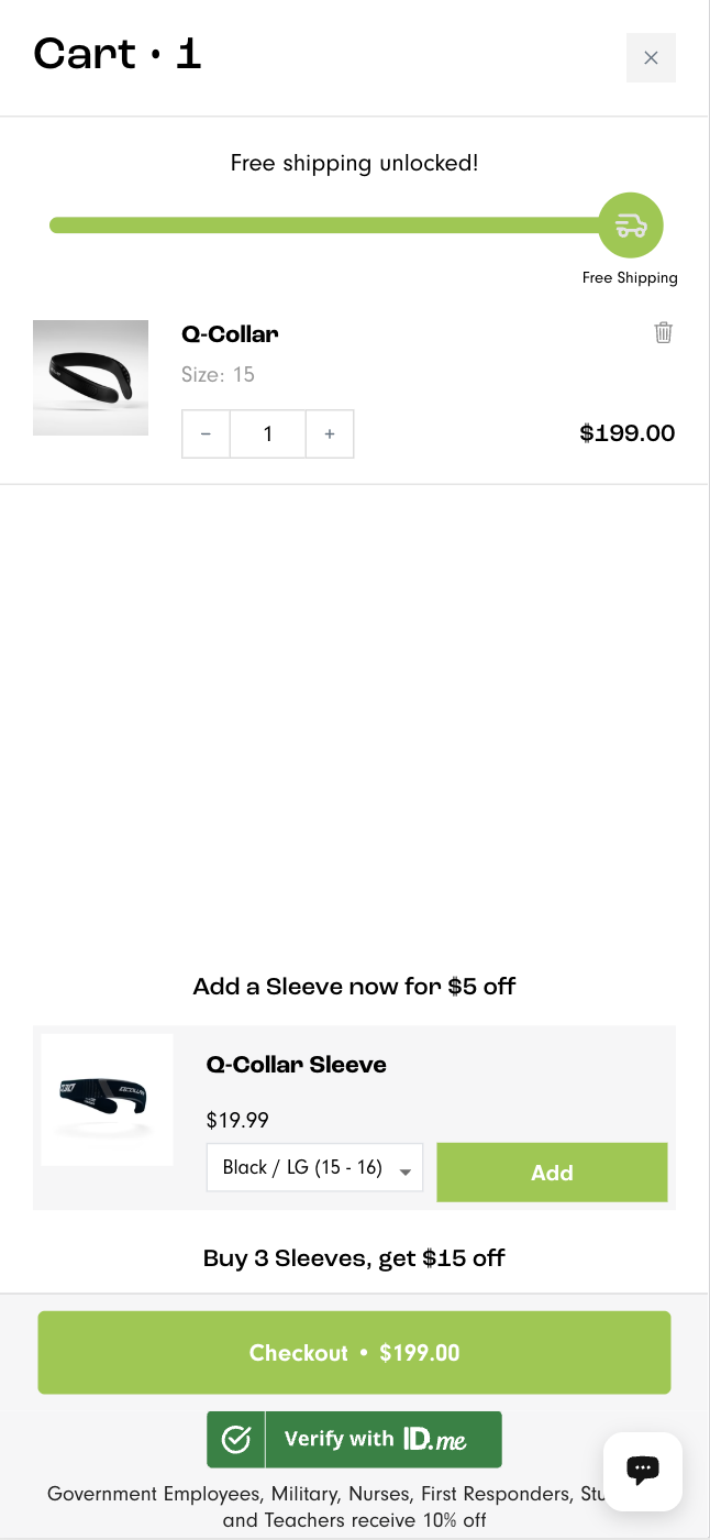
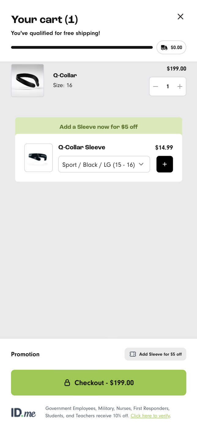
Mini-cart redesign with highlighted checkout button boosts conversions and revenue
Discover how a minicart redesign and clearer button placement led to a remarkable 26.7% increase in conversion rate. Get inspired by this experiment!
Metric
Revenue per visitor (RPV)
Lift change
+46.6%

Control

Variation
IF we move and restyle the checkout button to be more prominent AND remove the chat button from the minicart THEN more customers will proceed to the checkout BECAUSE customers will focus and click on the button instead of becoming distracted
What We Changed
- Made the checkout button more prominent.
- Removed the chat button from the minicart.
- Ensured no technical issues were present in the minicart.
- Retained the id.Me functionality.
Detailed breakdown
Conversion Rate
+26.7%
Add-to-Cart Rate
+11.3%
Average Order Value
+16.9%
Revenue
+41.4%
Bounce Rate
-2.1%
Key Learnings
- The id.Me functionality was actually killing the checkout rate
- Making the checkout button more obvious resulted in customers finding it much easier to get to the checkout
- The drastic improvement in conversion rate clearly shows how much the poor UX was hurting the store's conversion rate.
- This change took very little time to implement but had a huge impact.
- Recommendation: Leave the mini cart for 30 days then view user sessions and heatmaps to see if any subsequent friction has emerged.
