Homepage Recommendations Layout Redesign
Explore how a redesigned homepage layout for product recommendations increased engagement by 3.4%. Discover effective strategies for your brand!
Metric
Clickthrough rate
Lift change
+1.5%
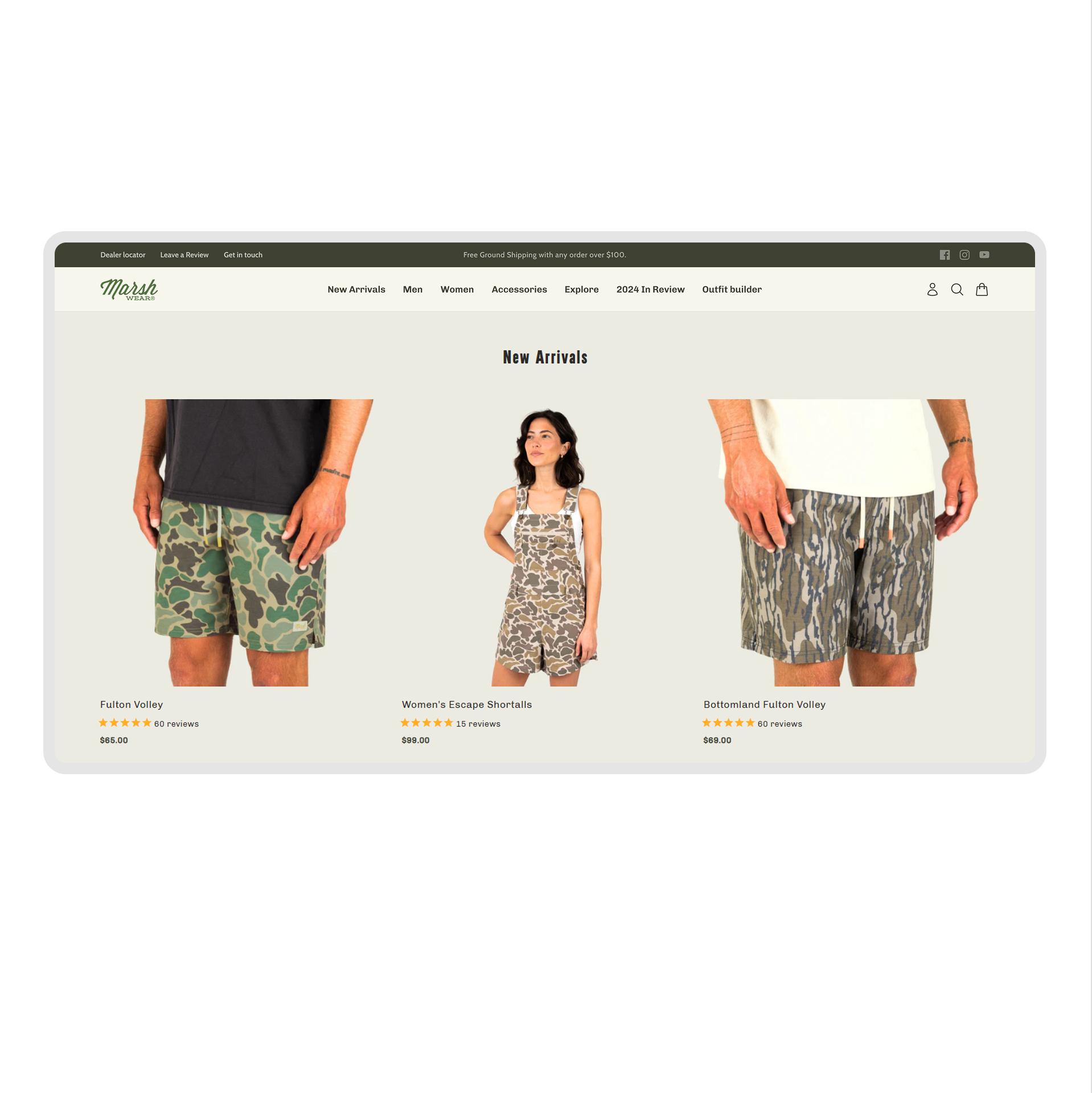
Control
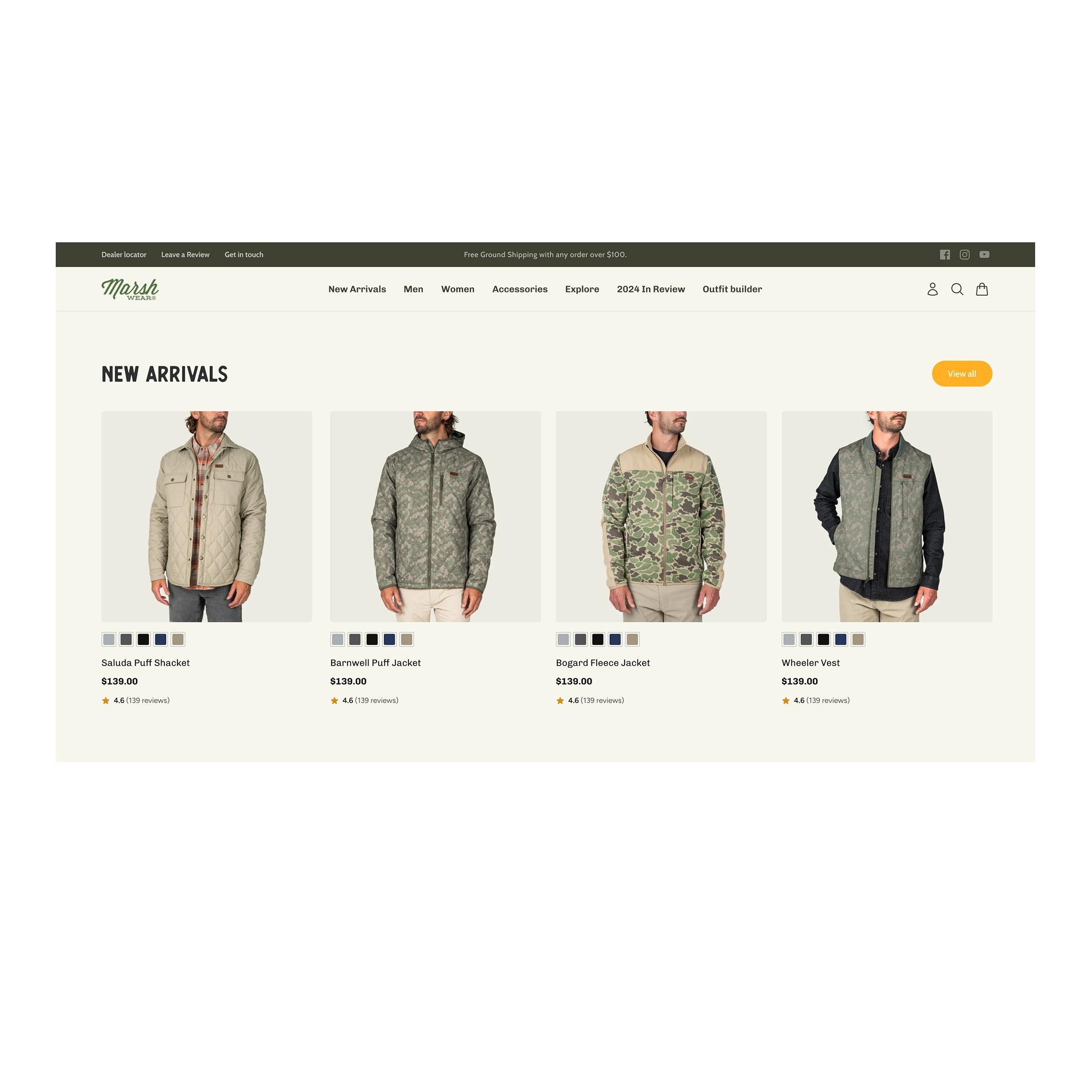
Variation
IF the product recommendations are shown in a single scrollable row with the “View All” link placed at the top, THEN more users will engage with individual products and click into the full collection, BECAUSE horizontal scrolling creates a smoother browsing experience and the repositioned CTA improves visibility and actionability.
What We Changed
- Changed from a grid layout to a horizontally scrollable single row.
- Moved "View All" link to the top, under "New Arrivals".
- Enlarged product images and reduced text size.
- Added color swatches and center-aligned content.
Detailed breakdown
Conversion Rate
+3.4%
Click-Through Rate
+1.5%
Revenue
+4.88%
Bounce Rate
-7.0%
Key Learnings
- Horizontal scrolling enhanced user navigation and engagement.
- The repositioned "View All" link increased visibility and click-throughs.
- Larger images and simplified text helped focus attention on products.
- Cleaner design reduced bounce rate and improved overall user interaction.