Minicart redesign increases checkout prominence and reduces distractions to boost conversions
Redesigning the minicart with a prominent checkout button and fewer distractions increased CTR but dropped conversion -9.9% and revenue -20.83%.
Metric
Conversion rate
Lift change
-9.9%
Control

Variation
IF we move and restyle the checkout button to be more prominent and remove the chat button from the minicart, THEN minicart-to-checkout conversion rate will increase, BECAUSE the clearer CTA placement and reduced distractions will help users focus on completing their purchase.
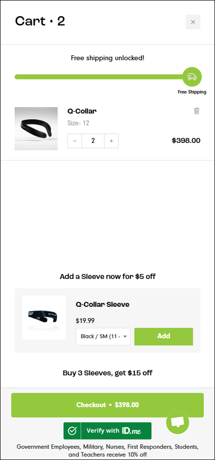
The checkout button was restyled with a high-contrast color and lock icon to increase visual prominence. The recommendations widget and chat button were removed from the minicart view to reduce distractions. Spacing and layout were adjusted to create a cleaner visual hierarchy focused on the checkout action.
Detailed breakdown
Conversion Rate
-9.9%
Add-to-Cart Rate
-3.5%
Click-Through Rate
+8.5%
Bounce Rate
-4.8%
Revenue
-20.83%
The minicart redesign drove +8.5% more click-throughs and reduced bounce rate by -4.8%, but conversion rate dropped -9.9% and revenue fell -20.83%. Stripping away the recommendations widget and chat button may have removed elements that actually helped users during the cart stage—product suggestions could have increased basket size, and the chat button may have resolved purchase hesitations. The prominent checkout button attracted clicks but didn't overcome the loss of supportive cart elements.